Cute Animal Illustration Styles To Master This Year
A single rounded ear, drawn at the wrong angle, can turn an adorable fox into a slightly unsettling rodent. That tiny margin between “charming” and “off-putting” is exactly why cute animal illustration has become one of the most technically demanding niches in digital art this year. It looks simple. It is not. Mastering the right proportions, line weight, and shading tricks separates illustrators who get hired for sticker packs, children’s books, and brand mascots from those who keep guessing.
Disclosure: This post contains affiliate links. As an Amazon Associate, we earn from qualifying purchases, and at no extra cost to you.
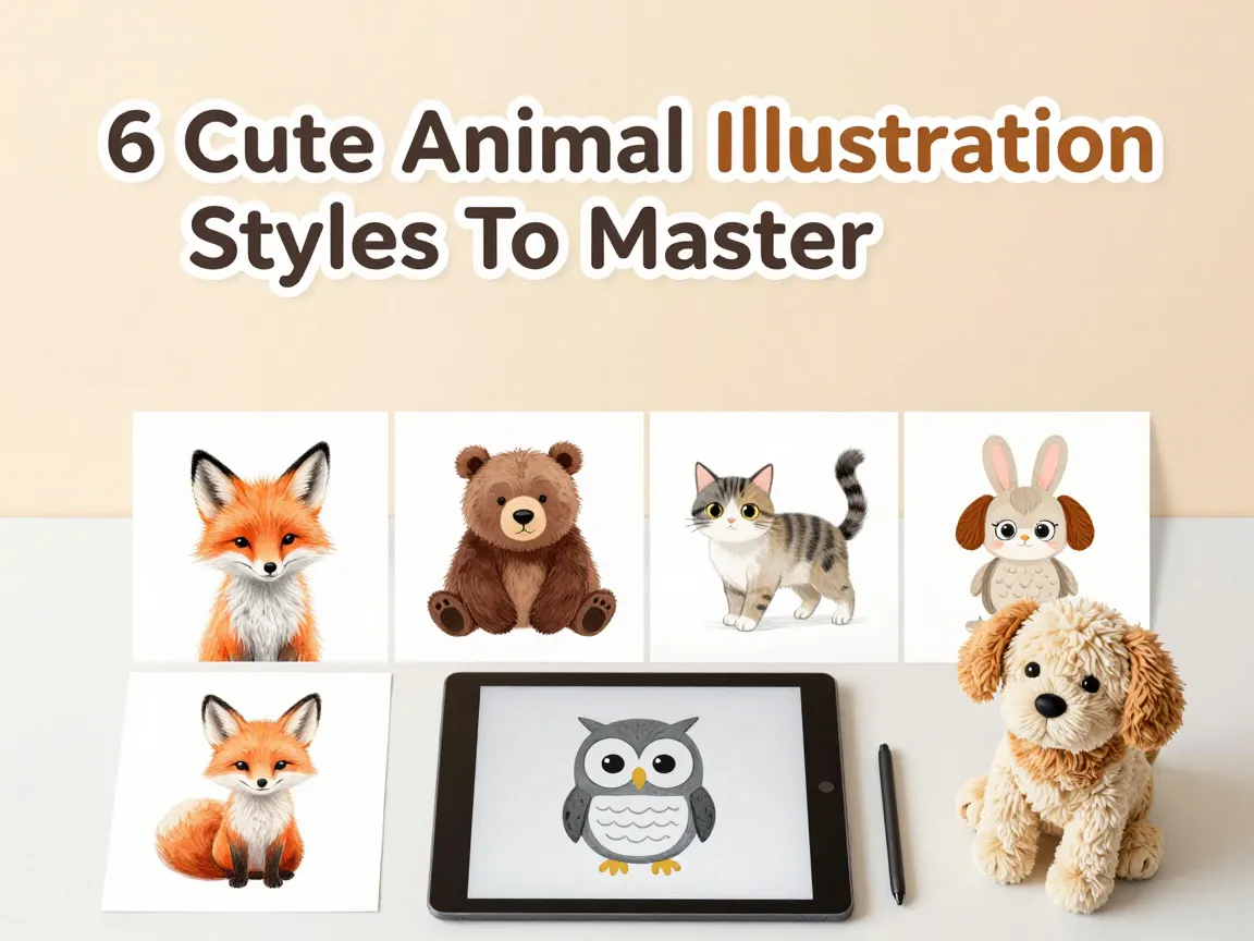
This guide breaks down the 6 Cute Animal Illustration Styles To Master This Year, based on what is actually trending across tutorial platforms, stock libraries, and professional portfolios right now. Each style has its own rules for proportion, line quality, and color, and each one serves a different commercial purpose. Whether the goal is a mobile game mascot, a baby shower greeting card, or a coloring book page, one of these six approaches will fit the brief.
Key Takeaways
- Cute animal illustration in 2026 revolves around six recognizable styles: soft stylized digital, baby-proportioned cartoon, personality-driven pet, chibi/kawaii, minimal doodle, and textured whimsical vector or soft 3D.
- Soft curves, oversized heads, and large eyes are the common thread across nearly every style, but each one applies these traits differently.
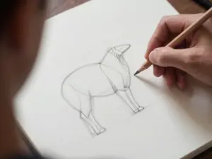
- Shape-first construction, starting with circles and ovals, remains the fastest and most reliable way to learn any of these six approaches.
- Personality and pose matter as much as proportion; pet-brand mascots and sticker packs now rely on expressive poses to communicate character traits.
- Choosing the right style depends on the final use case, whether that is a children’s book, a social media sticker, a product mascot, or an editorial illustration.
Why These 6 Cute Animal Illustration Styles To Master This Year Matter Now
Demand for cute animal characters has not slowed down. Publishers, app developers, and consumer brands all want friendly, approachable mascots that feel warm rather than sterile. Tutorial platforms updated throughout late 2026 confirm this shift, with new lessons focused specifically on soft shading, simplified shapes, and exaggerated “cute parts” like foreheads, cheeks, and ears.
What makes this year different is the sheer variety of commercially viable styles. A decade ago, “cute animal” mostly meant one flavor of cartoon. Now, brands distinguish between kawaii-inspired chibi designs, flat doodle icons for apps, and soft 3D renderings with plush-like texture. Illustrators who only know one approach are limiting their client pool. Learning all 6 Cute Animal Illustration Styles To Master This Year gives an artist the flexibility to pivot between a children’s book commission on Monday and a sticker-pack project on Friday.
There is also a technical reason these styles matter. Each one trains a different skill. Soft stylized shading builds control over gradients and volume. Chibi work sharpens proportion discipline. Personality-pose pets teach storytelling through body language. Practicing across all six makes an illustrator more versatile and, frankly, more hireable.
The 6 Cute Animal Illustration Styles To Master This Year
Below is a breakdown of each style, including its defining traits, typical use cases, and the core technique needed to pull it off convincingly.
1. Soft Stylized Digital Animal Style
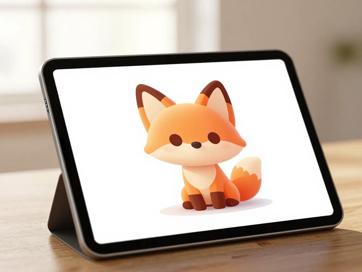
This style has become the default look across many digital art tutorials this year, and for good reason. It relies on smooth, curvy linework instead of sharp or straight edges. Every contour on the animal’s body bends gently, which immediately signals softness to the viewer’s eye.
The technique centers on three things: simple shapes, gentle shading, and highlighted “cute parts.” Artists build the animal from rounded blocks, then apply subtle light and shadow across the forehead, cheeks, and ear tips to create a sense of volume without heavy detail. The shading is never dramatic. It is soft, almost like diffused window light, which keeps the character feeling warm rather than moody.
This style works best for:
- Digital character art for apps and games
- Editorial illustrations that need warmth without looking childish
- Brand mascots aiming for a premium, polished feel
The main challenge is restraint. New illustrators often overdo the shading or add too many lines trying to show fur texture. The trick is to trust the simple shapes and let the lighting do the emotional work.
2. Baby-Proportioned Cartoon And Kids-Book Style
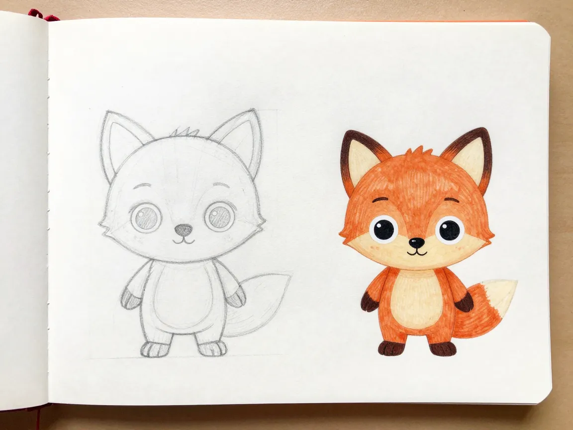
This is arguably the most foundational of the 6 Cute Animal Illustration Styles To Master This Year, because so many other styles borrow from it. The core idea is simple: make the animal look like a baby version of itself. Big head, small body, short limbs, large eyes, and round overall forms.
This proportion trick works because it mimics real baby-animal anatomy, which humans are biologically wired to find endearing. Tutorials updated through late 2026 consistently push three rules for this style:
- Simplify every shape down to its roundest version.
- Exaggerate one or two distinctive features, such as ears, a tail, or teeth.
- Avoid over-detailing. Fur texture, wrinkles, and fine shading should be minimal or absent.
This approach dominates children’s book illustration and classic cartoon character design. It is also the backbone of many commercial character sets because it reads as instantly friendly across age groups.
“The fastest way to ruin a cute cartoon animal is adding realism. The moment proportions start looking anatomically correct, the charm disappears.”
3. Personality-Driven Pet Character Style
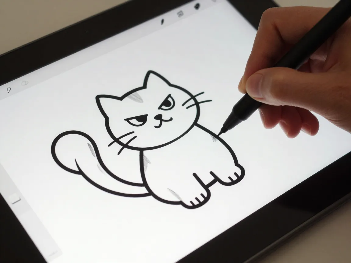
Where the previous two styles focus on proportion and shading, this one is built entirely around expression and pose. The construction method itself is deceptively simple. A cat, for example, can be built from just three overlapping circles: one for the head, one for the body, and one smaller circle for an accessory or paw detail.
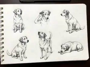
Once the basic shape exists, the real work begins. The animal gets pushed into a dynamic, expressive pose that tells a story before any color is added. A tilted head suggests curiosity. An arched back with a puffed tail suggests sass. A flopped-over pose suggests laziness. This is the technique behind most modern pet-brand mascots and the sticker packs flooding messaging apps.
| Element | Purpose |
|---|---|
| Simple circle base | Keeps construction fast and consistent across species |
| Dynamic pose | Communicates personality instantly |
| Facial expression | Reinforces the emotional read of the pose |
| Props or accessories | Adds context, like a leash, bowl, or toy |
This style rewards illustrators who think like storytellers rather than just draftspeople. Before drawing a single line, it helps to ask: what is this animal feeling right now, and how does its whole body show that feeling?
4. Chibi And Kawaii Cute-Animal Style
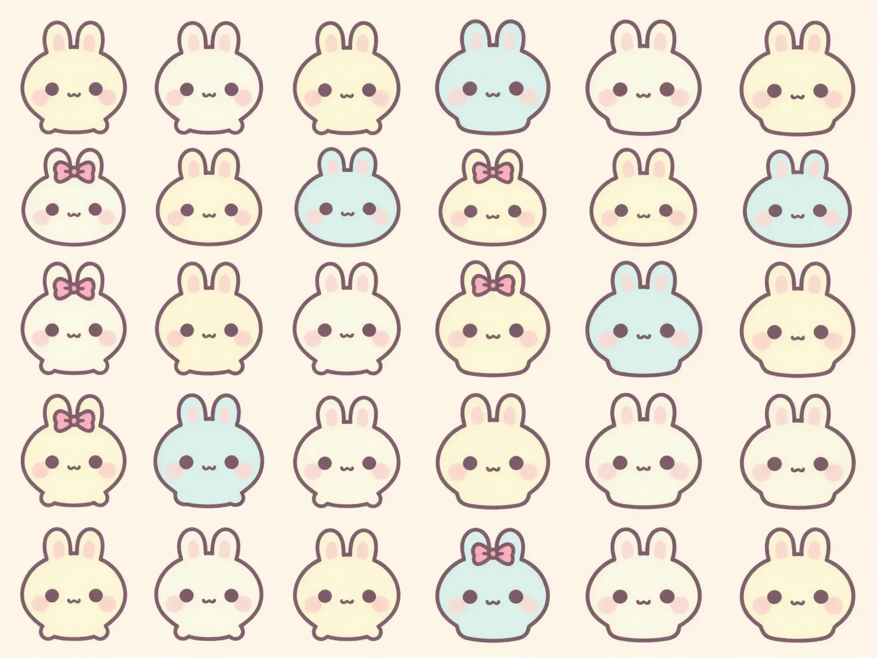
Chibi takes the baby-proportion idea and pushes it to an extreme. Bodies shrink down to almost nothing. Heads become enormous. Eyes take up a huge percentage of the face. Facial detail outside the eyes stays minimal, often just a small mouth or a tiny nose dot.
Color plays a bigger role in this style than in most others. Pastel-heavy palettes dominate, often paired with decorative extras like bows, ribbons, or tiny accessories that add charm without adding complexity. This combination of soft color and extreme proportion is what defines kawaii-style cute animals, separate from more realistic cartoon approaches.
Chibi’s biggest strength is consistency. Once an illustrator locks in the core proportions, that same formula applies across species. A small rounded body, oversized eyes, and tiny limbs can become a cat, a bear, a fox, or a rabbit just by swapping ear shape and color. This is exactly why chibi animals dominate sticker packs, mobile app icons, and spot illustrations in children’s books. The style standardizes so well that entire product lines can be built from one base template.
Common chibi production steps include:
- Draw a rounded body shape, roughly 60 to 70 percent smaller than a normal cartoon body.
- Add an oversized head, often larger than the body itself.
- Place two large eyes low on the face, close together.
- Keep the mouth and nose minimal, sometimes just a curved line or a small dot.
- Apply a pastel or bright flat color palette with optional decorative accents.
5. Minimal Doodle And Flat Cute-Animal Style
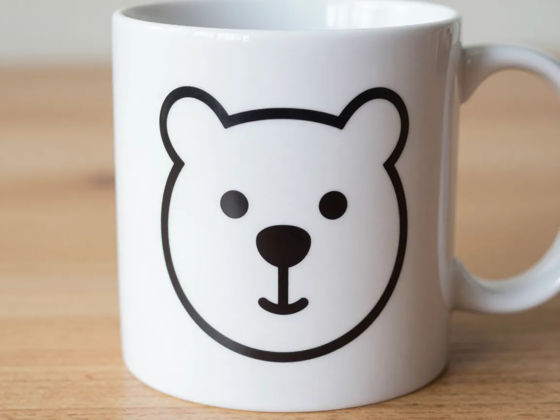
This style strips things down even further than chibi, but in a different direction. Instead of exaggerating cuteness through proportion, it relies on simplicity and graphic clarity. Think of the icons used in apps, the line-based animal faces printed on stationery, or the playful doodles that show up in social media graphics.
The construction method favors basic geometric shapes: circles, ovals, and triangles combined with rounded lines instead of sharp angles. Eyes are often placed low and oversized relative to the rest of the face, which borrows the same baby-proportion psychology used in other styles but renders it in a flatter, more graphic way.
Two sub-approaches fall under this umbrella:
- Hand-drawn doodle faces, which use simple line work, sparse detail, and often monochrome or limited color. These show up constantly in packaging design, stationery lines, and social backgrounds.
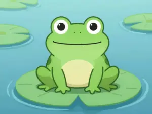
- Flat vector icons, which use solid color fills with almost no gradient or texture, built for scalability across app icons, UI illustrations, and infographics.
This style is the fastest to produce once mastered, which makes it popular for illustrators working on high-volume projects like icon sets or pattern design. Speed does not mean low skill, though. Getting a flat doodle animal to feel charming rather than lazy takes real understanding of proportion and line weight.
6. Textured Whimsical Vector And Soft 3D Character Style
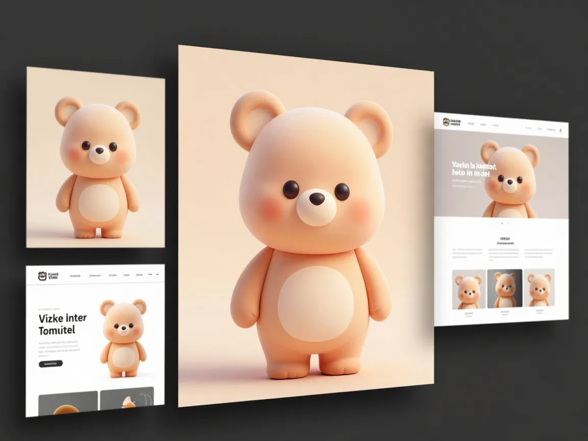
The sixth and most technically advanced entry on this list of 6 Cute Animal Illustration Styles To Master This Year blends two related but distinct trends showing up heavily in professional portfolios this year: textured whimsical vector illustration and soft 3D character rendering.
Textured vector work adds grain, subtle paper-like texture, or soft gradient noise to otherwise flat vector shapes. This gives illustrations a tactile, almost stamp-like quality that feels more premium than plain flat vector art. It shows up often in editorial illustration, packaging, and branding work where a brand wants charm without looking childish.
Soft 3D cute-character work takes the same baby-proportioned, round-bodied approach used in cartoon styles but renders it with volume, soft shadows, and plush-like surface quality, similar to a stuffed toy. This style has grown quickly in portfolio platforms, driven by demand for mascot characters that can be used across both static illustration and animated or app-based contexts.
Both sub-styles require more advanced tool knowledge than the others on this list, often involving layered gradients, soft lighting effects, and careful color blending. They are worth learning because they command higher rates in commercial work, particularly for branding and product mascot projects.
Quick Comparison Of The 6 Cute Animal Illustration Styles To Master This Year
| Style | Key Trait | Best Used For |
|---|---|---|
| Soft Stylized Digital | Gentle curves, subtle shading | Game and app characters |
| Baby-Proportioned Cartoon | Big head, round body | Children’s books, mascots |
| Personality-Driven Pet | Expressive pose, simple shapes | Pet brands, sticker packs |
| Chibi and Kawaii | Oversized head, huge eyes | Apps, stickers, merchandise |
| Minimal Doodle and Flat | Simple lines, flat color | Icons, packaging, UI |
| Textured Whimsical Vector and Soft 3D | Texture, plush volume | Branding, premium mascots |
How To Choose The Right Style For A Project
Not every project needs the same approach. Picking the wrong style can make an otherwise well-executed illustration feel mismatched to its purpose. A few questions help narrow things down quickly.
First, consider the platform. A mobile app icon needs a style that reads clearly at a tiny size, which points toward minimal doodle or flat vector work. A printed children’s book benefits more from baby-proportioned cartoon style, since it holds up well at larger sizes and supports more expressive storytelling across spreads.
Second, consider the brand tone. A playful, youth-focused brand might lean into chibi or kawaii aesthetics. A premium pet product brand might prefer the textured whimsical vector or soft 3D approach, since it signals quality without losing warmth.
Third, think about production speed. Minimal doodle and flat vector styles are fastest to produce at scale, which matters for projects needing dozens or hundreds of variations, like icon sets or pattern designs. Chibi is a close second, since its standardized proportions make species-swapping quick once the base template is locked.
A simple decision framework:
- Define the end platform, whether print, app, web, or social media.
- Match the emotional tone needed, from playful and silly to calm and premium.
- Estimate how many variations are needed and how fast they must be produced.
- Pick the style from the six above that satisfies all three constraints.
Tools And Techniques That Support All Six Styles
Regardless of which of the 6 Cute Animal Illustration Styles To Master This Year an artist focuses on, a few foundational techniques apply across the board.
Shape-first construction remains the most reliable starting point. Building animals from ovals, circles, and simple geometric blocks before adding detail keeps proportions consistent and prevents overworking. This approach shows up across nearly every major tutorial source this year, regardless of final style.
Line weight control also matters more than most beginners expect. A common technique involves using darker, slightly heavier lines on the outer contour of a shape, paired with thinner interior lines for details like paw pads or whisker dots. This contrast keeps the silhouette strong while still allowing for lighter internal detail. Simple, localized shadows, rather than complex rendered shading, keep the overall look clean and approachable.
Facial expression work deserves focused practice on its own. Wide eyes, angled eyebrow shapes, and simple curved mouth lines can completely change an animal’s perceived mood. Spending time sketching the same animal face with five or six different expressions is one of the fastest ways to improve across every style on this list.
Finally, software choice matters less than habit. Many of this year’s most-followed tutorials use layer-based digital painting tools that support smooth brush curves and easy shading adjustments. The specific software matters less than consistent practice with shape construction, line weight, and expression.
Common Mistakes To Avoid Across These Styles
Even experienced illustrators slip into a few predictable traps when working across multiple cute animal styles.
- Mixing proportion rules between styles, such as adding chibi-level eye size to a textured vector piece that calls for more restrained features.
- Overdetailing fur or texture in styles meant to stay simple, which flattens the charm instead of enhancing it.
- Ignoring pose and relying only on facial expression to convey personality, especially in the personality-driven pet style.
- Using harsh, straight lines in styles that depend on soft curves, which can make a character look stiff or even unsettling.
- Skipping color planning, particularly in chibi and kawaii work, where pastel palette choices directly affect how “cute” the final piece feels.
Avoiding these mistakes often comes down to slowing down during the planning phase. A rough thumbnail sketch, checked against the specific style’s core rules, catches most of these issues before they reach final line art or color.
Final Thoughts On The 6 Cute Animal Illustration Styles To Master This Year
Cute animal illustration is not one skill. It is six overlapping but distinct disciplines, each with its own proportion rules, shading logic, and commercial use case. Soft stylized digital work rewards subtlety. Baby-proportioned cartoon style rewards restraint. Personality-driven pet design rewards storytelling through pose. Chibi and kawaii reward proportion discipline and color planning. Minimal doodle and flat style reward graphic clarity. Textured whimsical vector and soft 3D work reward technical polish.
Frequently Asked Questions
Is it necessary to master all six styles, or just one?
Specializing in one style is a valid career path, but learning the basics of all six makes an illustrator far more adaptable across client types, from children’s publishers to app developers to pet brands.
Which style is easiest for beginners?
Minimal doodle and flat cute-animal style is usually the fastest to learn, since it relies on simple shapes and limited detail. Baby-proportioned cartoon style is a close second and teaches proportion skills that transfer to every other style.
Do these styles require different software?
No specific software is required for any of them. What matters more is comfort with layer-based shading tools for the soft stylized and 3D styles, and clean vector tools for the flat and textured vector styles.
How long does it take to get comfortable with a new style?
With focused daily practice, most illustrators can produce competent work in a new style within two to four weeks, though reaching a polished, client-ready level typically takes a few months of consistent practice.
Can these styles be combined in one project?
Yes, though it requires care. A common approach is using one core style, such as baby-proportioned cartoon, for a mascot’s main design, then applying flat doodle versions of the same character for small icons or social graphics.
Conclusion
Cute animal illustration has grown far beyond a single cartoon look. The 6 Cute Animal Illustration Styles To Master This Year, soft stylized digital, baby-proportioned cartoon, personality-driven pet, chibi and kawaii, minimal doodle and flat, and textured whimsical vector or soft 3D, each serve different commercial needs and reward different technical strengths. The fastest path forward is practical: pick one style to start, practice shape-first construction daily, study expression and pose separately from proportion, and gradually expand into the other five styles as client needs demand. Illustrators who build fluency across this full range position themselves for a much wider range of commercial work, from children’s books and branding to app icons and sticker packs, throughout the rest of this year and beyond.