Flame Point Siamese Cat Drawing Tips For Getting Those Toasty Colors Right
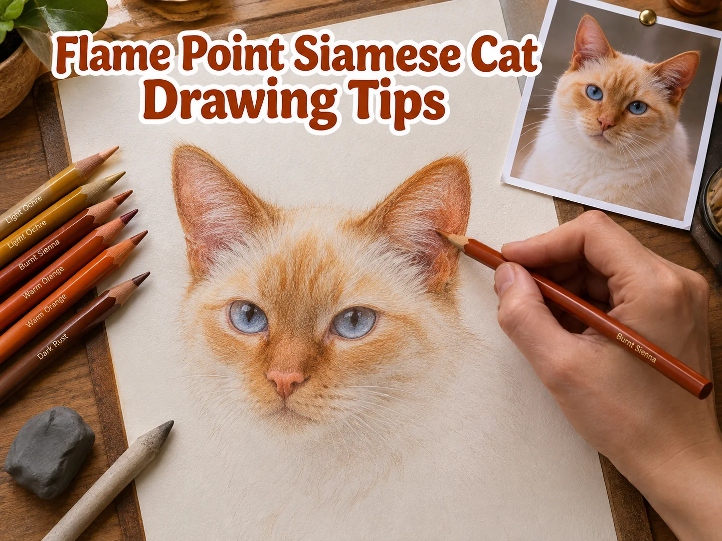
A flame point Siamese carries one of the rarest coat patterns in the entire cat world, and most artists get the color wrong on the first three tries. The reddish-orange points fade unevenly, the cream body turns muddy, or the mask looks like a smudge instead of a glow. This guide breaks down 6 Flame Point Siamese Cat Drawing Tips For Getting Those Toasty Colors Right so the warm tones land exactly where they belong, every time.
Disclosure: This post contains affiliate links. As an Amazon Associate, we earn from qualifying purchases, and at no extra cost to you.
Flame point Siamese cats are prized for a very specific look: a pale, creamy or near-white body paired with vivid orange-red coloring concentrated on the ears, face, tail, and legs. That contrast is what makes the breed so visually striking, and it is also exactly what trips up artists who treat the coloring like a simple gradient. Getting the “toasty” effect right requires a mix of solid construction drawing, smart color placement, and layered shading technique. The six tips below walk through the process step by step, from the first pencil line to the final warm highlight.
Key Takeaways
Before diving into the full breakdown, here is a quick summary of what matters most when tackling this subject.
- Start with light construction shapes (circles for head and body, triangles for ears) before adding any color, so proportions stay accurate.
- Study real flame point reference photos to understand exactly where the orange-red pigment concentrates versus where the cream body stays pale.
- Build color in thin layers rather than one heavy pass, since flame point fur has soft gradients, not flat blocks of color.
- Use warm neutrals like burnt sienna, light ochre, and soft browns to transition between the points and the body without harsh edges.
- Save the deepest, most saturated orange for small focal areas like the tips of the ears and the bridge of the nose to keep the “toasty” glow believable.
Understanding Flame Point Coloring Before You Draw
Flame point Siamese cats trace back to the traditional Siamese lineage that originated in Thailand, and they remain one of the rarest color varieties within that lineage. Unlike a solid-colored cat, a flame point has a very specific color map: the body stays creamy or nearly white, while the “points”, ears, mask, legs, paws, and tail, carry a distinct reddish-orange hue. That warm coloring is caused by a temperature-sensitive pigment gene, which is why the coolest parts of the cat’s body (the extremities) end up with the most saturated color, while the warmer torso stays pale.
This biological detail matters for artists because it explains the pattern you are trying to recreate on paper. It is not random shading. The color intensity follows the cat’s own body heat map, which is why reference study is so important before any pigment touches the page.
Online communities dedicated to flame point coloring, including step-by-step photo tutorials shared in adult coloring groups, consistently show the same pattern: warm tones start dense at the very tips of the ears and nose, then soften and lighten as they blend into the body. A Pinterest board dedicated specifically to flame point Siamese drawing references, though a fairly niche search topic, confirms that artists across skill levels return to the same handful of visual cues again and again: dark ear tips, a warm mask around the eyes, and a gradually fading tail.
Keeping this color map in mind before you start sketching will make every one of the six tips below far easier to apply correctly.
6 Flame Point Siamese Cat Drawing Tips For Getting Those Toasty Colors Right
The following six tips cover the full process, from initial construction lines to final color layering. Each one builds on the last, so working through them in order will produce the most consistent results.
1. Build Accurate Construction Lines Before Adding Any Color
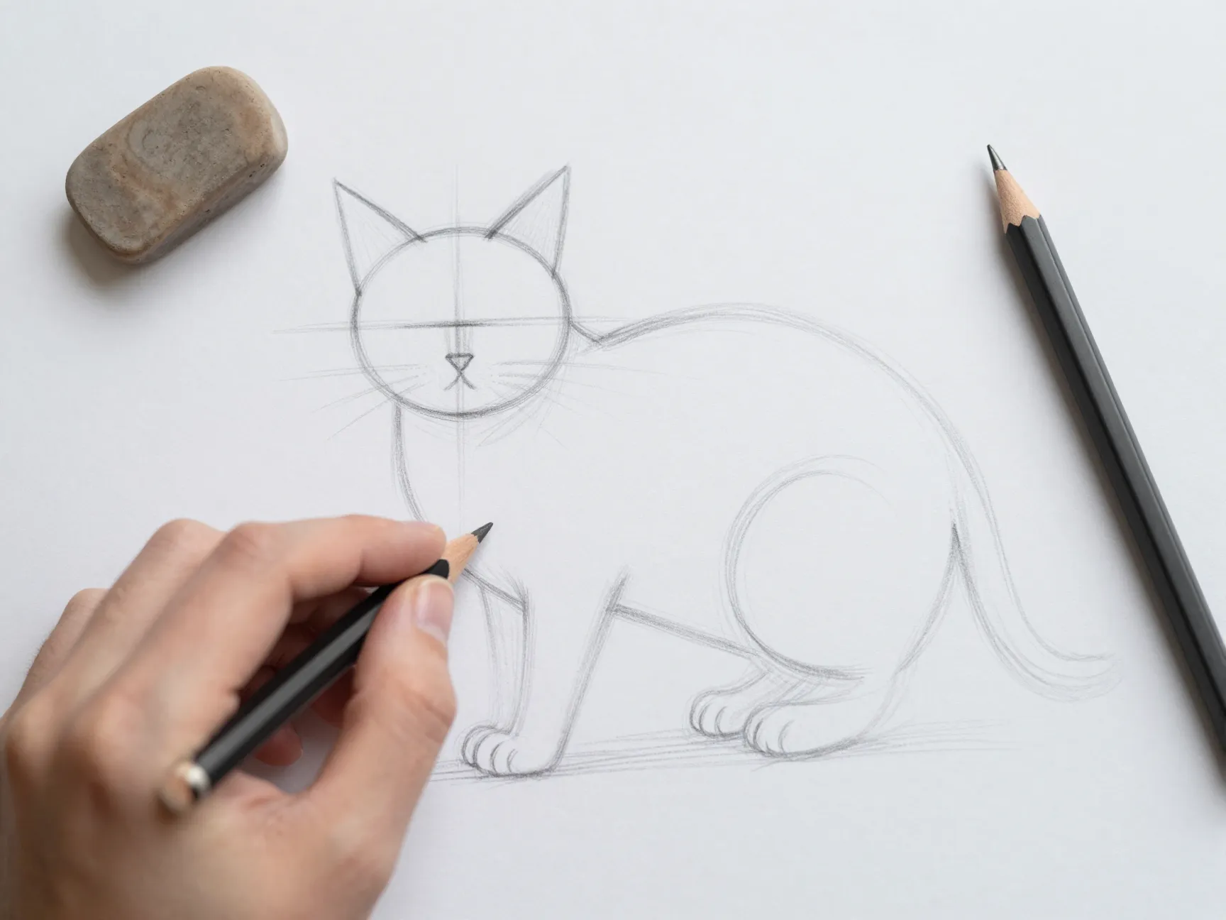
Every reliable Siamese cat tutorial, whether aimed at beginners or more advanced artists, starts the same way: with light, loose construction shapes rather than a finished outline. The most detailed step-by-step instructions recommend two main circles, one for the head and one for the body, followed by a smaller circle for the muzzle and simple guidelines across the face to place the eyes, nose, and mouth accurately.
This step feels tedious to skip past, but it is the single biggest factor separating a flat, awkward drawing from one that reads as a real cat. A minimalist version of this approach uses just a central circle, a vertical line, and a bottom oval to rough in posture, then adds the tail, ears, and a widened neck afterward. Either method works, as long as the lines stay light enough to erase later.
Why does this matter specifically for flame point coloring? Because color placement depends entirely on accurate feature placement. If the muzzle circle is off-center or the ear triangles are the wrong size, the warm point color will sit in the wrong spot no matter how carefully it is applied later. Construction lines are the foundation that makes every other tip on this list actually work.
A simple checklist for this stage:
- Draw one circle for the head and one larger oval for the body, kept small and light.
- Add a smaller circle inside the head for the muzzle area.
- Sketch two triangle shapes for the ears, angled slightly outward.
- Mark a horizontal guideline for eye placement and a vertical line for facial symmetry.
- Rough in the tail and legs with simple curved lines, no detail yet.
2. Map Out the Points Before Committing to Color
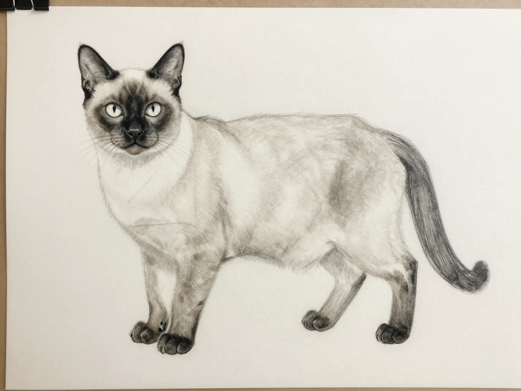
Once the construction lines are solid, the next step is deciding exactly where the flame point coloring will go. This is different from cartoon-style Siamese tutorials, which often focus on quick, expressive facial features first. For a flame point specifically, the color map needs its own planning pass.
Lightly sketch the boundary lines where the warm color will start and where the cream body will take over. On a real flame point cat, this boundary is soft and feathered, never a hard edge. Mark these zones:
- The ear tips and outer ear edges, where color is usually most concentrated.
- The mask area around the eyes, nose, and cheeks, forming a rough diamond or triangle shape.
- The legs and paws, where color often fades gradually toward the toes.
- The tail, which frequently shows a deeper, richer tone than the rest of the body.
Sketching this map in pencil first, before any pigment is applied, prevents the common mistake of over-coloring the whole cat or under-coloring the points so much that the “flame” effect disappears entirely.
3. Choose a Warm-Neutral Palette That Supports Toasty Tones
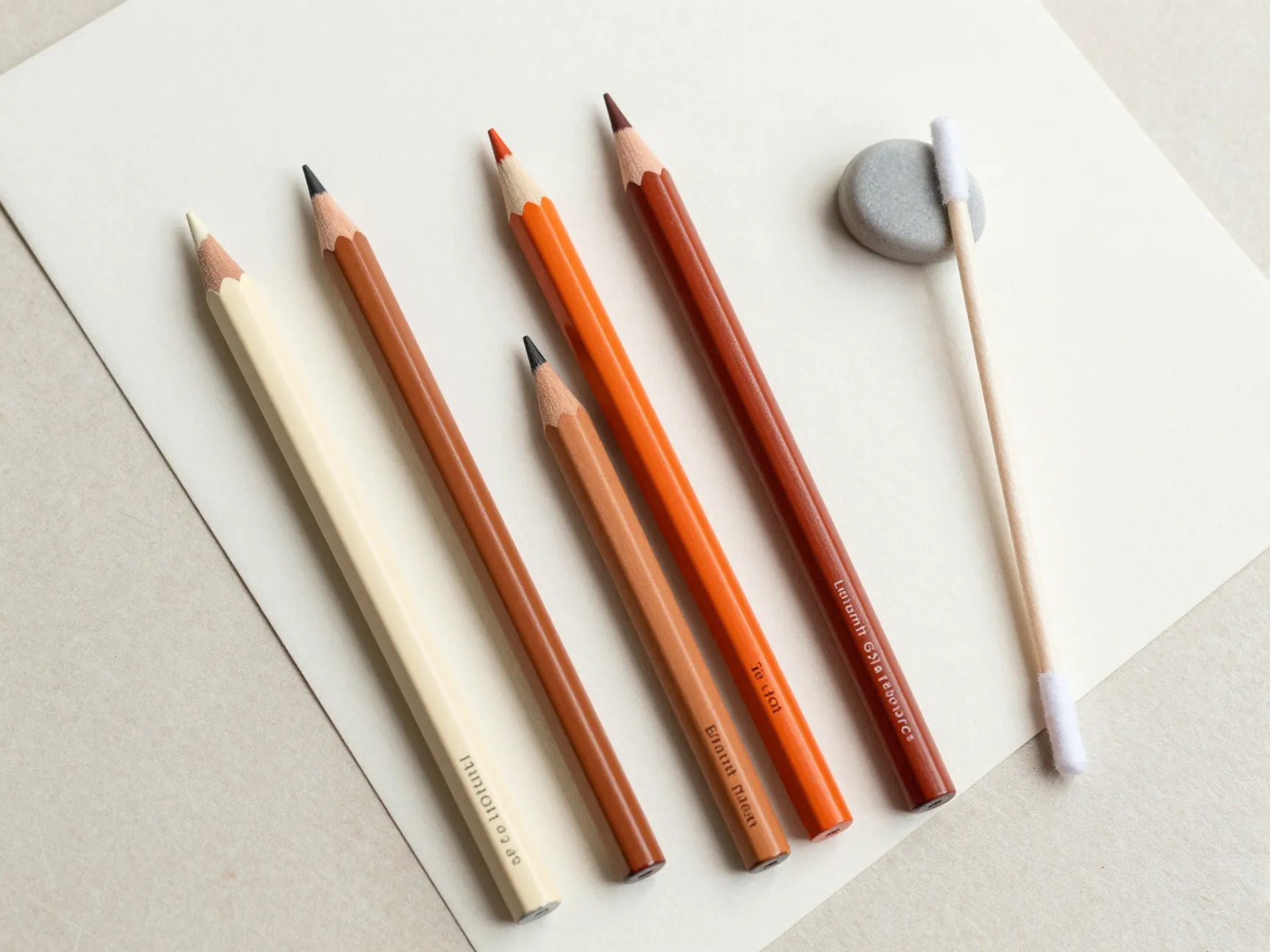
Color choice is where most flame point drawings go wrong. Reaching for a single bright orange pencil or marker and filling in the points will produce a flat, cartoonish look rather than the soft, “toasty” warmth that defines this variety. Layer-based color tutorials that focus on subtle point coloration (originally developed for lilac point Siamese cats but fully adaptable here) recommend building color from a base of warm neutrals rather than starting with saturated pigment.
A practical palette for flame point fur includes:
| Color Role | Suggested Tone | Where to Use It |
|---|---|---|
| Base warm neutral | Light ochre or pale cream | Entire body, as the underlying tone |
| Transition tone | Burnt sienna or soft brown | Edges where points fade into body |
| Point color | Warm orange-red | Ear tips, mask, tail, paws |
| Deep accent | Dark rust or deep brown | Innermost ear tips and nose bridge only |
Working with pencils such as Faber-Castell Polychromos or Caran d’Ache Luminance on a smooth Bristol board surface makes blending these warm neutrals far easier, since the tooth of the paper holds enough pigment for layering without turning waxy or muddy.
4. Layer Color Gradually Instead of Filling In Flat Blocks
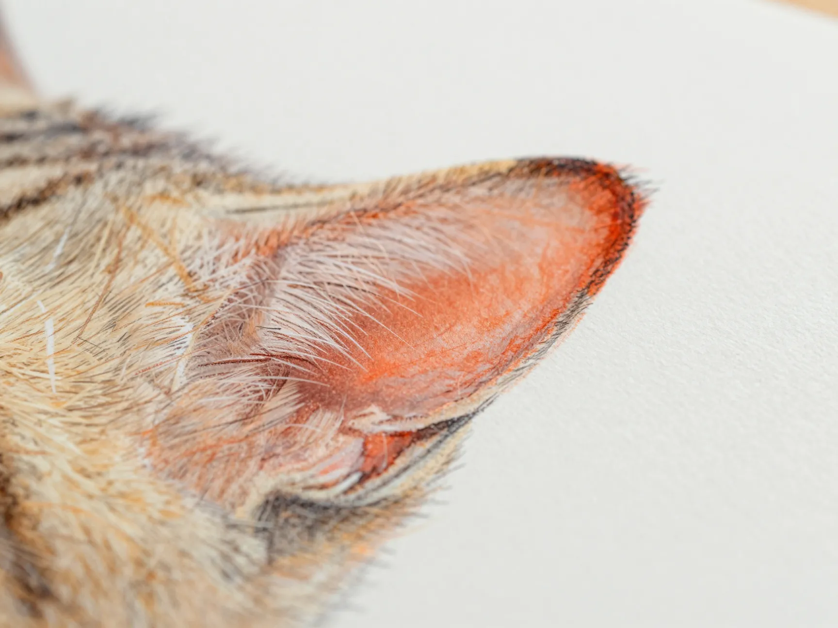
This tip is arguably the most important of the six when it comes to getting the “toasty” quality right. Flame point fur is never a flat color. It shifts gradually from deep orange-red at the very tips of the ears to a soft peach, then to nearly pure cream across the body. Trying to achieve that effect in one pass, with one pencil or one paint layer, almost always produces a flat, artificial-looking result.
Instead, build color the way experienced colored-pencil artists build fur: in thin, overlapping layers.
- Lay down the lightest cream base across the entire body first, including the point areas.
- Add a light layer of the transition tone (burnt sienna or soft brown) only in the areas mapped out in tip 2.
- Layer the warm orange-red point color on top, starting light and building up gradually with repeated passes.
- Reserve the darkest, most saturated color for only the smallest focal areas, such as the very tip of the ear or the bridge of the nose.
- Blend the edges of each layer with a light circular motion so no hard line separates one tone from the next.
This layering approach mirrors the process described in color-pencil tutorials that use Pan Pastels alongside traditional pencils to soften transitions further. A small piece of blending stump or a cotton swab can help push pigment into smoother gradients without lifting too much color.
5. Frame the Warm Points With Clean, Simple Silhouettes
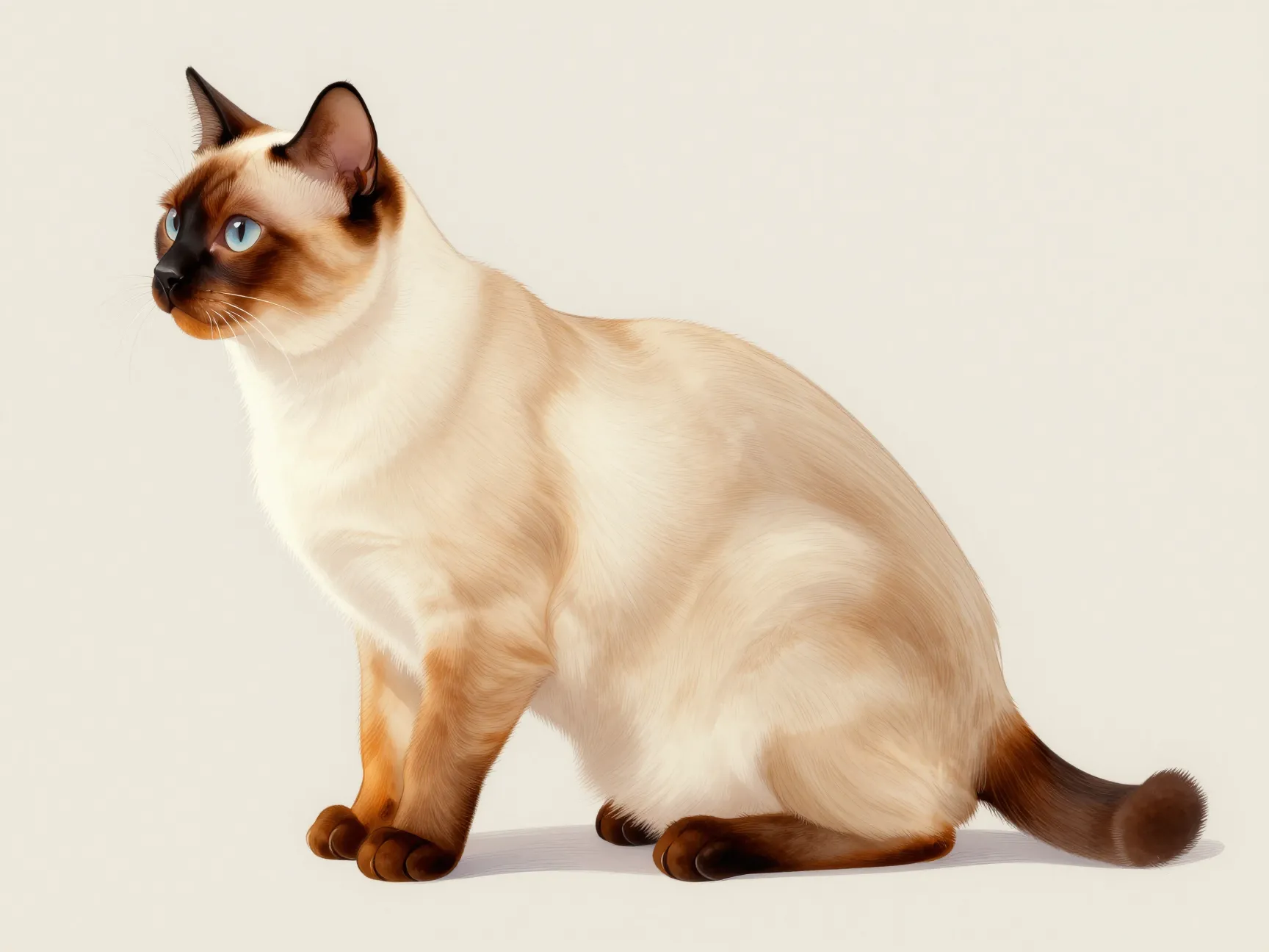
Cartoon-style Siamese lessons consistently emphasize one detail that applies just as well to more realistic flame point drawings: the color only reads clearly if the outline around it is clean and simple. Several tutorials build their entire cat starting from the facial features (the mouth and eyes first), then wrap smooth, curved outlines around those features before anything else is added.
For flame point coloring specifically, this matters because busy, overly detailed line work competes with the warm color for the viewer’s attention. A cluttered outline makes even well-blended orange tones look messy. A clean, confident silhouette does the opposite: it frames the toasty color so it reads as intentional and vivid rather than accidental.
Practical ways to apply this:
- Keep the final ink or outline pass minimal, using only the lines needed to define the cat’s shape and features.
- Avoid heavy cross-hatching or dense texture lines directly on top of the point color areas.
- Let the color transitions themselves suggest fur texture rather than relying purely on line work.
- If working digitally, keep the line art layer on a lower opacity so it does not fight with the color layer underneath.
6. Add Final Highlights and Shadow to Sell the Toasty Glow
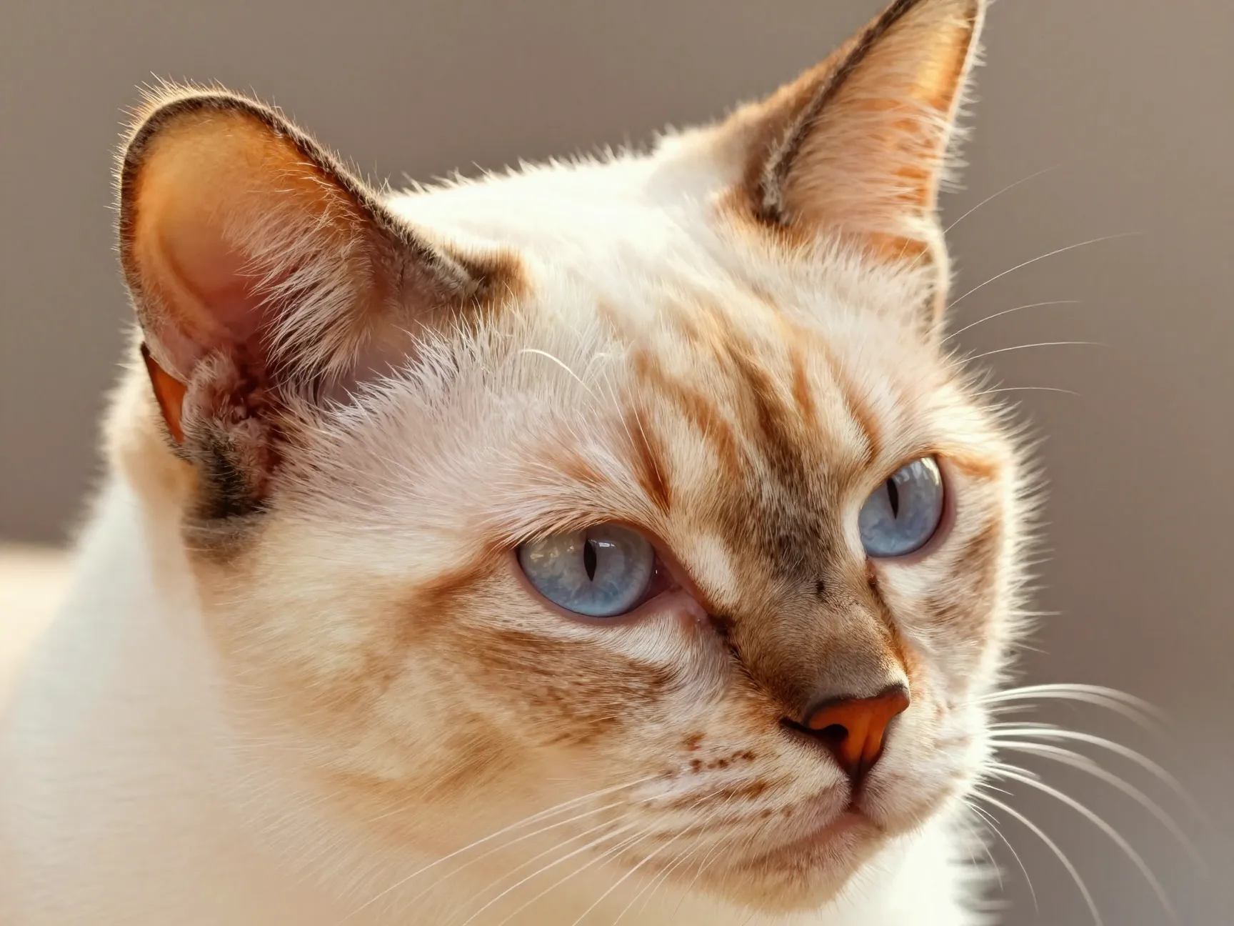
The last tip focuses on the finishing touches that make flame point coloring look believable rather than flat. Once the base layers and gradients are in place, a small number of highlight and shadow additions push the drawing from “colored in” to “glowing.”
- Add a soft, light highlight along the top curve of each ear, where light would naturally catch warm fur.
- Deepen the shadow slightly at the inner ear and under the chin, using a cooler brown rather than pure black.
- Add one or two fine strokes of pale cream directly through the point color to suggest individual fur strands catching light.
- Step back from the piece periodically, or zoom out if working digitally, to check that the warm points still read clearly against the pale body from a distance.
Realistic and semi-realistic Siamese lessons published in recent years consistently reinforce that these finishing touches, done in moderation, are what separate an amateur color job from one that convincingly captures the breed’s signature warmth. Overdoing highlights, however, can wash out the careful gradient work from tip 4, so restraint matters just as much as technique here.
Common Mistakes to Avoid When Coloring Flame Points
Even artists who understand the six tips above can stumble on a few recurring issues. Watching for these mistakes ahead of time saves a lot of rework.
- Using one flat orange for all the points instead of building gradual layers, which flattens the “toasty” effect completely.
- Skipping construction lines and guessing at proportions, which shifts the point color onto the wrong parts of the face or ears.
- Making the body too dark or too warm overall, which erases the contrast that defines a flame point in the first place.
- Over-detailing the outline with heavy cross-hatching that competes with the soft color gradients underneath.
- Ignoring reference photos and relying purely on memory, which often leads to color placement that looks generic rather than breed-accurate.
A short pull-quote worth keeping in mind while working through any of these stages:
“Flame point color is a gradient story, not a flat fill. Every hard edge is a missed opportunity for warmth.”
Tools and Materials That Make These Tips Easier to Apply
While technique matters more than materials, certain supplies genuinely make it easier to achieve the layered, toasty effect described above.
| Material Type | Why It Helps |
|---|---|
| Smooth Bristol board or hot-press paper | Holds fine layers of pigment without excess texture disrupting gradients |
| Colored pencils with a wax or oil base | Blend smoothly and build saturation gradually across multiple passes |
| Soft pastel dust or Pan Pastels | Softens transitions between point color and body cream tone |
| Blending stump or cotton swab | Pushes pigment into edges for seamless gradient work |
| Kneaded eraser | Lifts small amounts of color to add highlights without a hard white gap |
None of these tools are strictly required, but they consistently show up across tutorials focused on subtle, layered point coloration, which supports the idea that the right materials make the six tips easier to execute rather than replacing the technique itself.
Frequently Asked Questions
What makes flame point Siamese cats different from other point colors?
Flame point Siamese cats have reddish-orange point coloring rather than the darker seal, blue, or chocolate tones seen in other Siamese varieties. This orange coloring comes from a specific pigment combination and is considered one of the rarer point colors within the breed.
Do I need to draw the whole cat before adding color?
Yes. Completing construction lines and a rough outline first ensures the point color lands in the correct anatomical locations, such as the ear tips and mask, rather than drifting onto the body or being misplaced due to inaccurate proportions.
Can these tips work for digital drawing as well as traditional media?
Absolutely. The layering principle in tip 4 and the clean silhouette principle in tip 5 apply directly to digital painting, where separate layers for base color, point color, and highlights mimic the same gradual build-up used in colored pencil work.
Why does my flame point drawing look orange all over instead of just on the points?
This usually happens when the color map from tip 2 is skipped, or when a single warm tone is applied to the entire cat instead of being reserved for the mapped point zones. Going back to a clear boundary sketch before adding pigment usually resolves this.
How can I make the point color look less flat and more realistic?
Focus on tip 4’s layering process and tip 6’s highlight and shadow work. Flat color almost always comes from applying one shade in one pass rather than building gradual layers with soft blending at the edges.
Conclusion
Capturing the warm, rare coloring of a flame point Siamese cat comes down to preparation and patience more than raw talent. Solid construction lines set the foundation, a clear color map prevents warm tones from spreading into the wrong areas, and a thoughtful, warm-neutral palette keeps the gradient believable. Layering color gradually, framing it with a clean silhouette, and finishing with restrained highlights are what ultimately sell the “toasty” glow that makes this breed so visually distinctive.
Anyone ready to put these ideas into practice should start small: pick one reference photo of a flame point Siamese, sketch the basic construction shapes, and focus on just the ear color transition before attempting the full cat. Mastering that one gradient makes every other point area easier to render with confidence. Revisit each of the 6 Flame Point Siamese Cat Drawing Tips For Getting Those Toasty Colors Right as needed while practicing, since returning to fundamentals is often what separates a flat drawing from one that truly glows.